

The concept of authoritative data is inextricably linked to Western methods of cultural understanding. When we expect data to be clean, neat, and authoritative, we are leaving behind more complex questions of ownership and history. Susan Elizabeth Gagliardi and Constantine Petridis’s article “Mapping Senufo: Making Visible Debatable Information and Situated Knowledge” makes the case for an expansion of our implicit beliefs about data using West African art as an example. In these cases, Gagliardi and Petridis found typical “tombstone” style data to be insufficient; aside from dubious methods of obtaining provenance from early 20th century collectors, very rarely are these works attributed to a single person or even a single use. In their case, the only things they could identify with any reasonable amount of certainty were the approximate locations that these objects were crafted in. While this has the potential to be the case for a large swath of art historians, there is not a lot of work going on to standardize the ways in which this information is represented in databases. This is an interesting conundrum- the way we structure and standardize data is essential to its legibility and usability, but it is clearly not serving everyone in the ways that it should. While I’m not fully sure I understand the more expressive, illustrative visualization methods proposed for Mapping Senufo, I appreciate that they are grappling with this question and attempting to propose alternative methods of promoting understanding.

The slippery nature of data is easy enough to talk about, but it becomes really clear when you start working with it. In our workshop this week, we took a look at a few visualization methods using API data from the Tate. Each of the 65,000+ entries in the spreadsheet had a reasonable amount of tombstone information in them, but a few factors quickly limited what we could do with the data. Firstly, any field with unstandardized text (or text at all, really) was immediately off the table for generating graphs and charts. This meant that anything with a date range or uncertain creator was inaccessible for this form of visualization. For the Tate this is less of a problem since they do not particularly focus on antiquities, but for many other museums, any level of uncertainty makes data from whole eras and movements inaccessible. This was something I also ran into while working on my CollectionBuilder exhibit– when looking at the material culture of spiritualism in the late 19th and early 20th century, many of these objects were used and refined over long periods of time. Attribution is also further complicated by the fact that many of these objects are a type of ephemera intended to be used in performance and never acknowledged as true objects with authorship- to acknowledge that the “ectoplasm” is a thin linen pulled from the nose of Helen Duncan would immediately and irrevocably alter the purpose of the object by disrupting the suspension of disbelief. While the specific dilemmas any field of research faces regarding the certainty of their classification and identification will be different, this exercise has driven home the point that complete standardization of data is virtually impossible (even with just ten items).
In addition to looking at the textual metadata for images, we also took some time to look into text analysis this week. It was something I had been vaguely aware of, but didn’t quite know the extent of what you could do with it. I thought the project Mining the Dispatch was particularly successful in illustrating what text analysis can do. The tool looks at trends in the Richmond Daily Dispatch throughout the duration of the Civil War; when viewing graphs of multiple trends at once, hypotheses start to form. For instance, viewing trends for clothing advertisements alongside trends of articles mentioning trade can illustrate when some of the effects of blockades were starting to be felt by Virginians. In order to explore text analysis on our own we looked at the tool Voyant, which creates a dashboard of potential textual analysis tools for one or more textual documents. It offers word clouds, trends on word usage, frequency of phrases, correlations between words and phrases, and a number of visualization tools to represent the text.
Since I had a PDF of Patience Worth’s Magazine that I used for my digital exhibit, I was curious what results Voyant would return for the first and last issues of the magazine. The language of Patience Worth is perhaps the most notable and most debated part of her works (besides the authenticity of her otherworldly origin); written in a faux-archaic English, her poems and fiction never seem to falter in their own internal logic system. Voyant offers a ton of different ways to visualize and understand Patience’s notoriously dense writing style as well as track changes from document to document. I was curious to see how mentions of Pearl Curran, the “channeler” of Patience, changed from the first issue to the last issue, and Voyant showed a clear drop in the frequency of “Curran” (most likely because the context of Patience’s writings was long out of the way by the final issue).
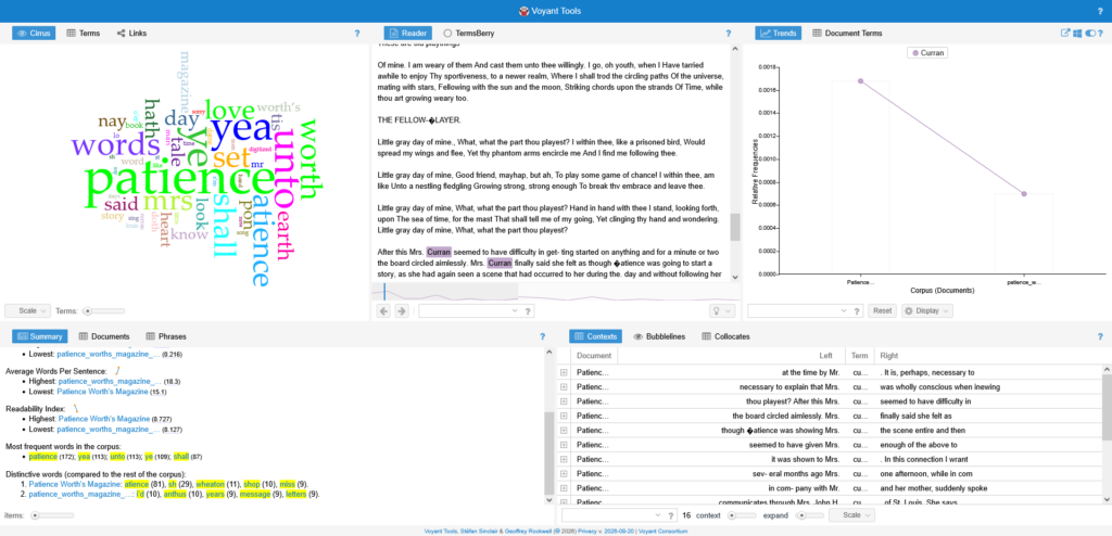
Of course this is just a beta version of the tool, but it still was very interesting to see what I could get out of it! And, as we learned this week, the tool is only as good as what you can put into it- these PDFs fortunately had decent OCR, but anything with poor OCR, large files, or more than two pdfs is unusable with this iteration of Voyant.
As for what types of data I might be interested in working with, I’m honestly not too sure. To be frank, I don’t have a clear, defined research topic- everything I drew from this week was from a lifelong personal interest in the occult, not true academic research. However, working with CollectionBuilder these past two weeks has offered me some more interesting ways of using metadata to visualize similarities and differences. I would be interested in using museum APIs to visualize collection data and explore trends, but that does unfortunately rely on museums to have very clear and unambiguous metadata. As we have learned from Mapping Senufo, that can be extremely difficult to come by.
Gagliardi, Susan Elizabeth, and Constantine Petridis. “Mapping Senufo: Making Visible Debatable Information and Situated Knowledge.” The Art Institute of Chicago, December 19, 2022. https://www.artic.edu/digital-publications/37/perspectives-on-data/23/mapping-senufo-making-visible-debatable-information-and-situated-knowledge.


Leave a Reply